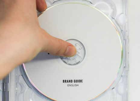
For All Eyes was born out of the urge to push the boundaries of what Inclusive Design means. We consider those who do not have full access to their faculty of sight by transcending the reliance on the visual in an attempt to make the field of design a more accessible space.
Through multi-sensory design, For All Eyes aims to debunk misconceptions, foster respect and inclusion and make designs that can be understood without sight to illustrate how design can become about more than just the visual
IF WE CHANGE THE WAY WE THINK ABOUT DESIGN, A VISUAL IMPAIRMENT DOES NOT HAVE TO BE DISABLING.
Our logo comes from our acronym ‘FAE’
which is then translated into braille.
Even though braille won’t be understood right away by everyone, it holds the connotation of sight. Considering
not everyone understands braille, it becomes an invitation
to participate and learn. The use of dots make it striking enough to be easily seen by the partially sighted.
More than being used as braille, dots carry the notion
of encompassing all and thus being inclusive.
Master Logo
Logo Type

Variations
The logo can be printed in black ink or the ink can
be omitted and the logo can be embossed debossed,
or cut-out.
Size
The logo should never be smaller than 20mm in width.
Large scale use is encouraged.

Avoid
- Rotation, distortion or warping
- Using another font for the logotype other than what is specified in the type section of this guide
- Placing the type anywhere else in relation to the logo other than what is specified
Exclusion Zone
The exclusion zone ensures legibility and impact of the logo. This zone should be considered the absolute minimum.
The exclusion zone is equal to the height of one dot
(marked y) placed at the outermost edge of each side.


For printing purposes always consider ways to make the design tactile. Consider ways in which you can cut out, emboss, deboss and so forth. Always consider if an audio version can work with your design. The goal is to express each element in more than one way.


